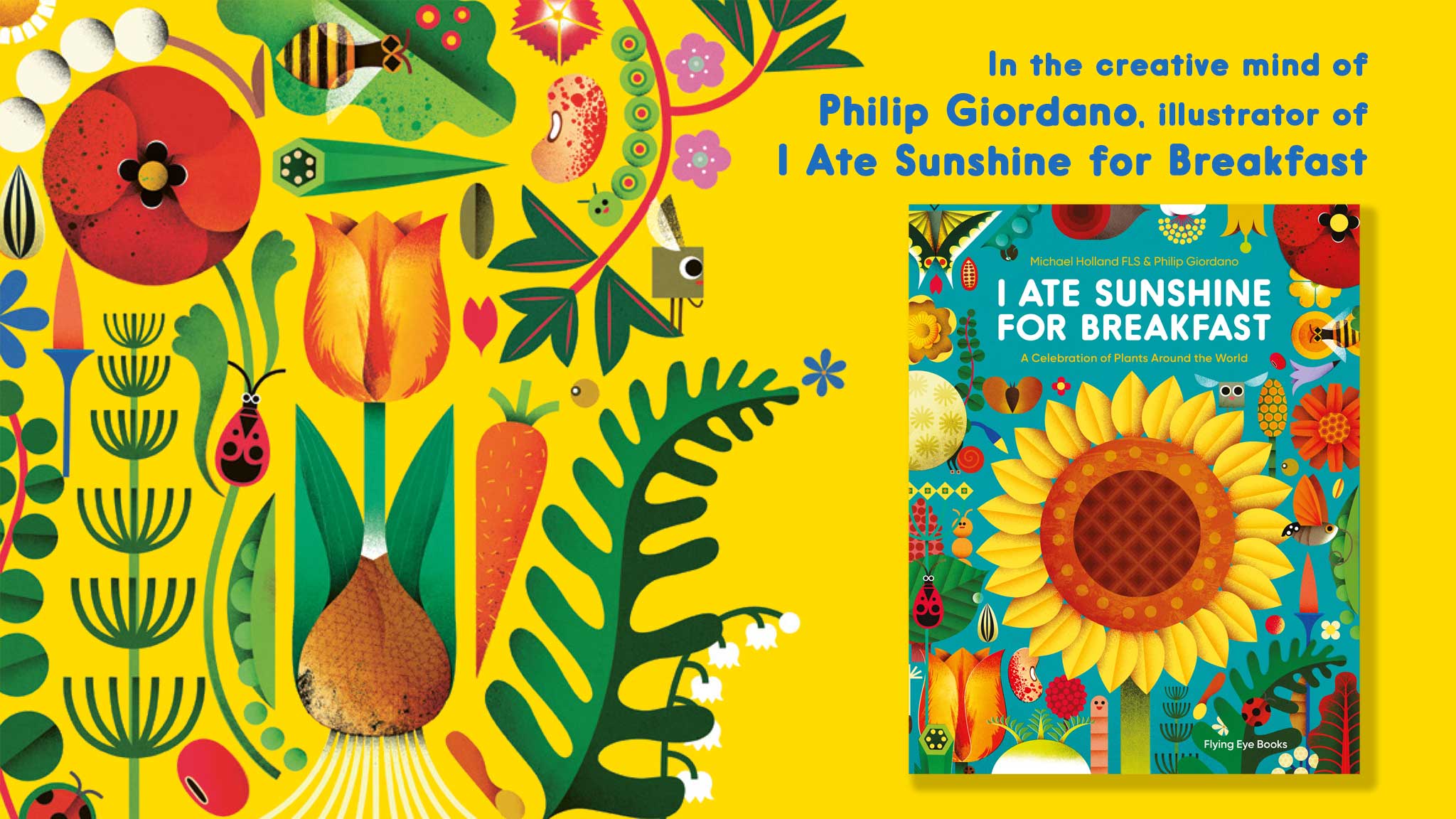
In this time of strange uncertainty and worry, so many of you have been loving the bright and beautiful illustrations from I Ate Sunshine for Breakfast, so to tell you a bit more about them, we had a (socially distant) chat with their creator, Philip Giordano.
Born in a small coastal town in Liguria, Italy, to a Filipina mother and Swiss father, Philip Giordano is a tireless globetrotter, who now lives and works in Tokyo. After studying at the Brera Academy of Fine Arts and at the European Institute of Design, he earned a Master in Animation in Turin. He works for a number of magazines and publishing houses around the world, illustrating book covers, designing toys, and creating children’s books and animations.
The simple and colorful shapes of his illustrations, his iconic characters, and his graphic landscapes render his unique style immediately recognizable and transform his stories into breathtaking visual journeys.
Flying Eye Books: The illustrations of I Ate Sunshine for Breakfast are absolutely stunning and brimming with life from all kinds of habitats. Where did you get your inspiration for the book?
Philip Giordano: When I was young, I grew up surrounded by plants. I was lucky because my home in Italy is located between the sea and the green Ligurian countryside. My mother taught me her love for gardening. I remember that inside the house we had large trunks where she planted the orchids she brought from the Philippines (her native country) and other exotic plants that she grew to feel connected to her Asian roots. It felt like being in a jungle.
As a child, I was struck by a photo of Margaret Mee (a British botanical artist specialized in plants from the rainforest and ecological activist) in one of my mum’s gardening magazines. She was suspended over the forest intent on painting the flower of a species that blooms only at night (I think it was called Moonflower).
So I started collecting plants and became a plant nerd at an early age, hoping one day to become like her: a sort of brave 19th-century explorer and discoverer of new species. And I knew for sure that I wanted to draw them!
FEB: Illustrating text written by expert ecologist and educator Michael Holland, did you learn a lot of things about the wildlife you never knew before?
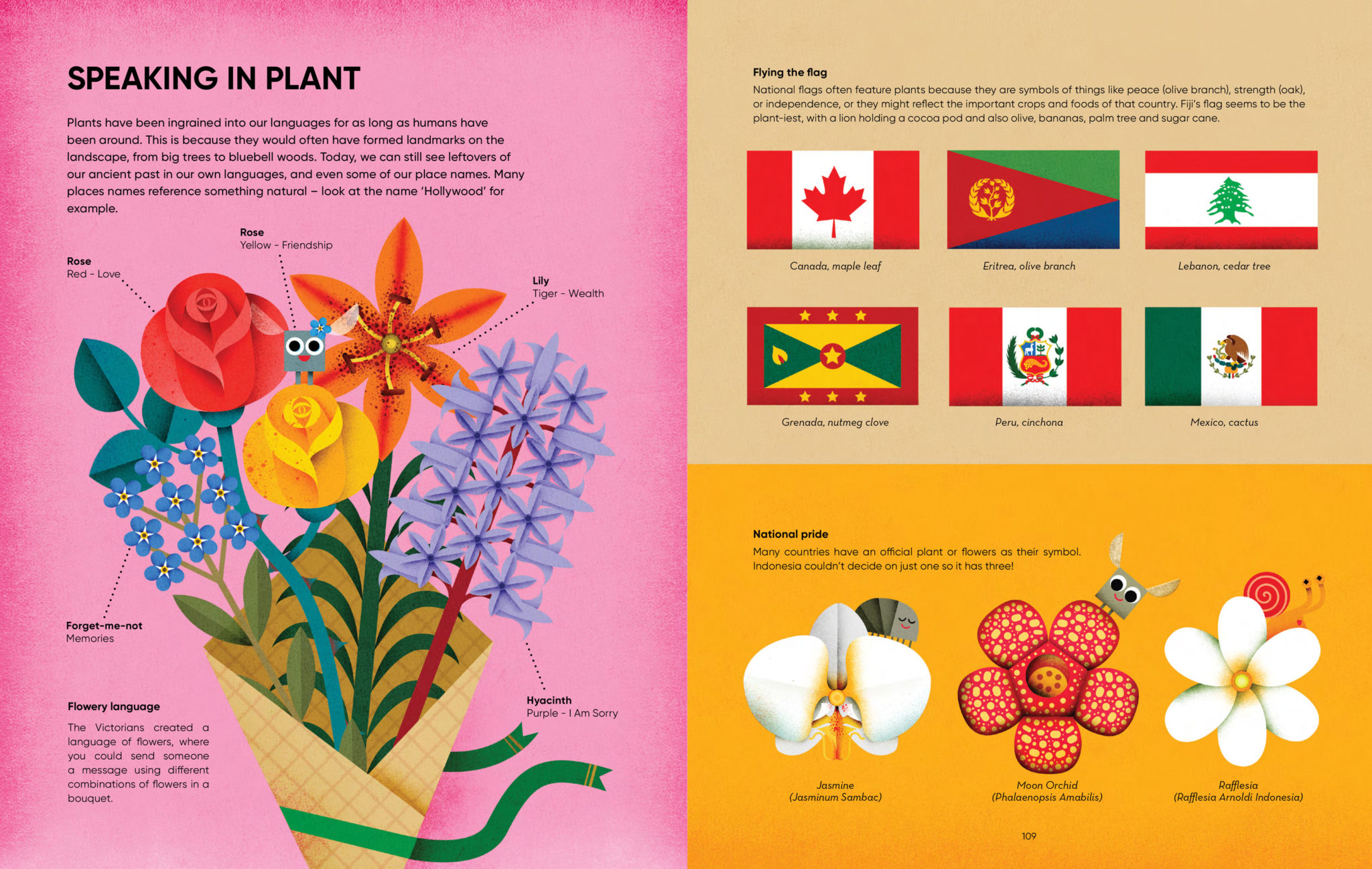
PG: I already had some knowledge of the plant world, but working on “I Ate Sunshine for Breakfast” I discovered a lot of facts, especially from chapter three where Michael explains how much plants are present in and connected to our daily life. For example, when he talks about a fern from New Zealand that Māori hunters would use to find their way back home after hunting at night because the undersides of these plants’ fronds are visible. I was amazed to learn this!
FEB: Working with educational and factual text on nature did you find it difficult to accurately illustrate plant and animal anatomy whilst making sure the children understand the processes of nature visually?
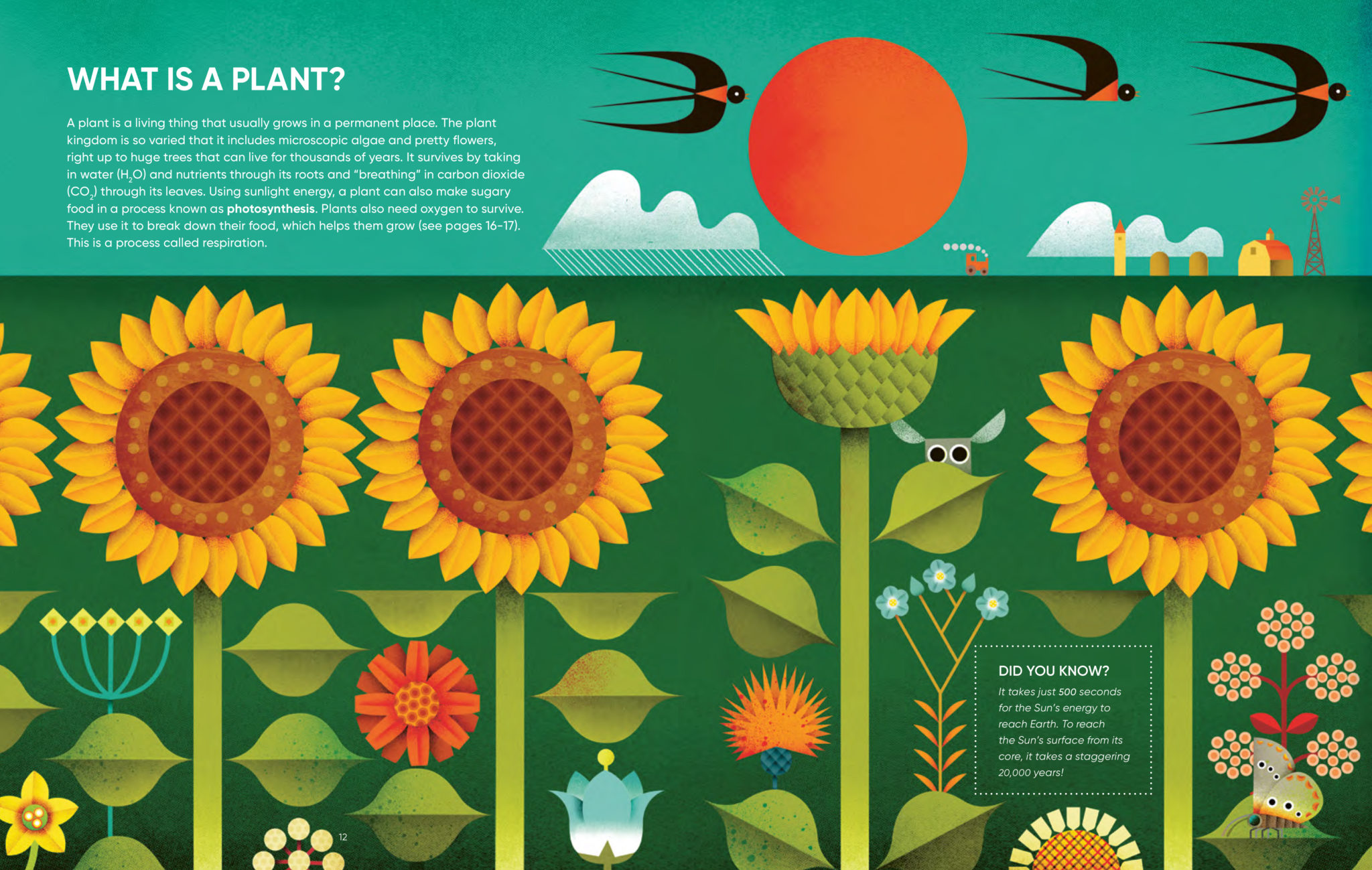
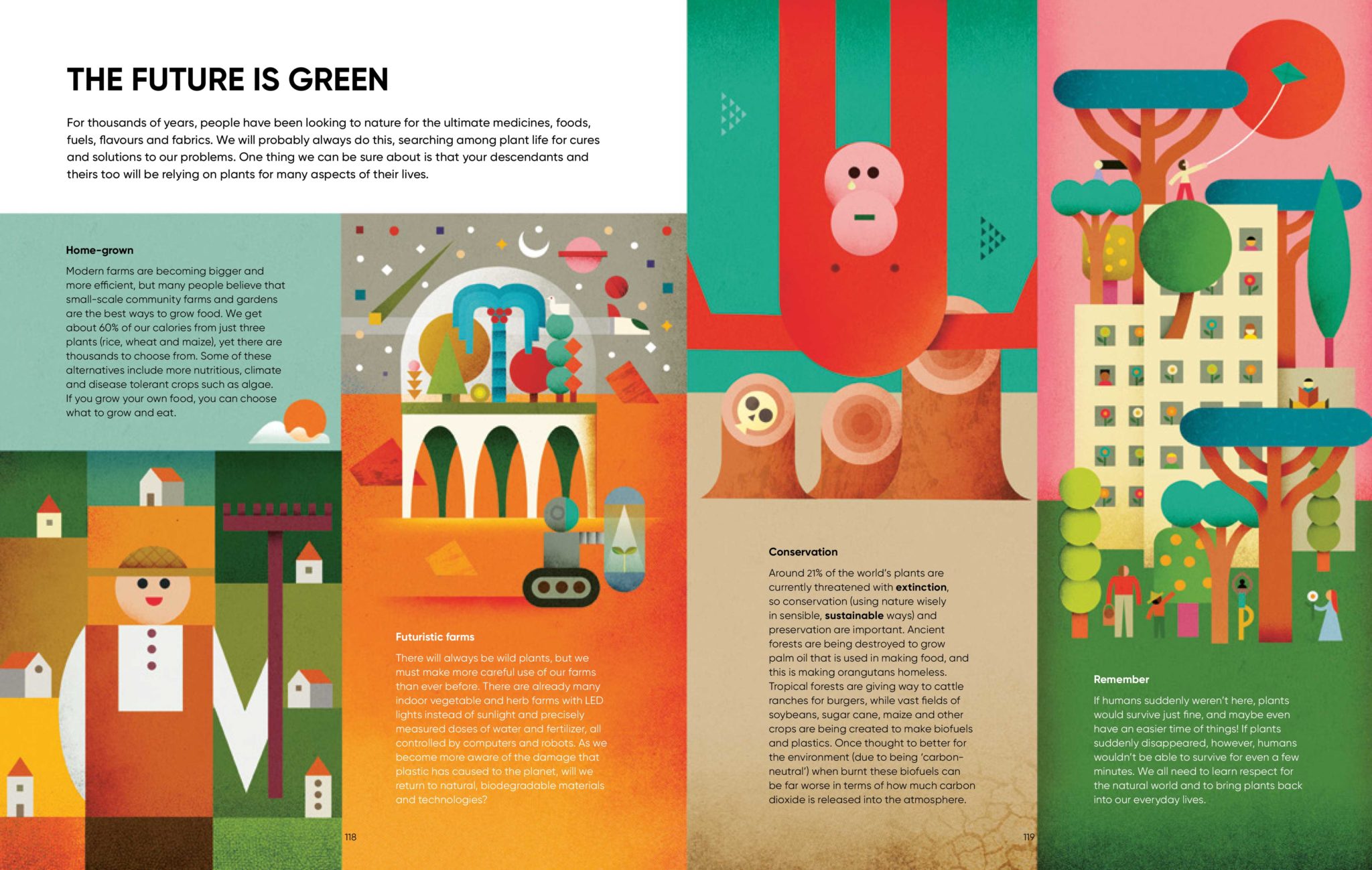
PG: The main challenge was to create scientific illustrations while maintaining my geometric, abstract, colourful and surreal style. I hope I stuck a good balance amongst all these elements.
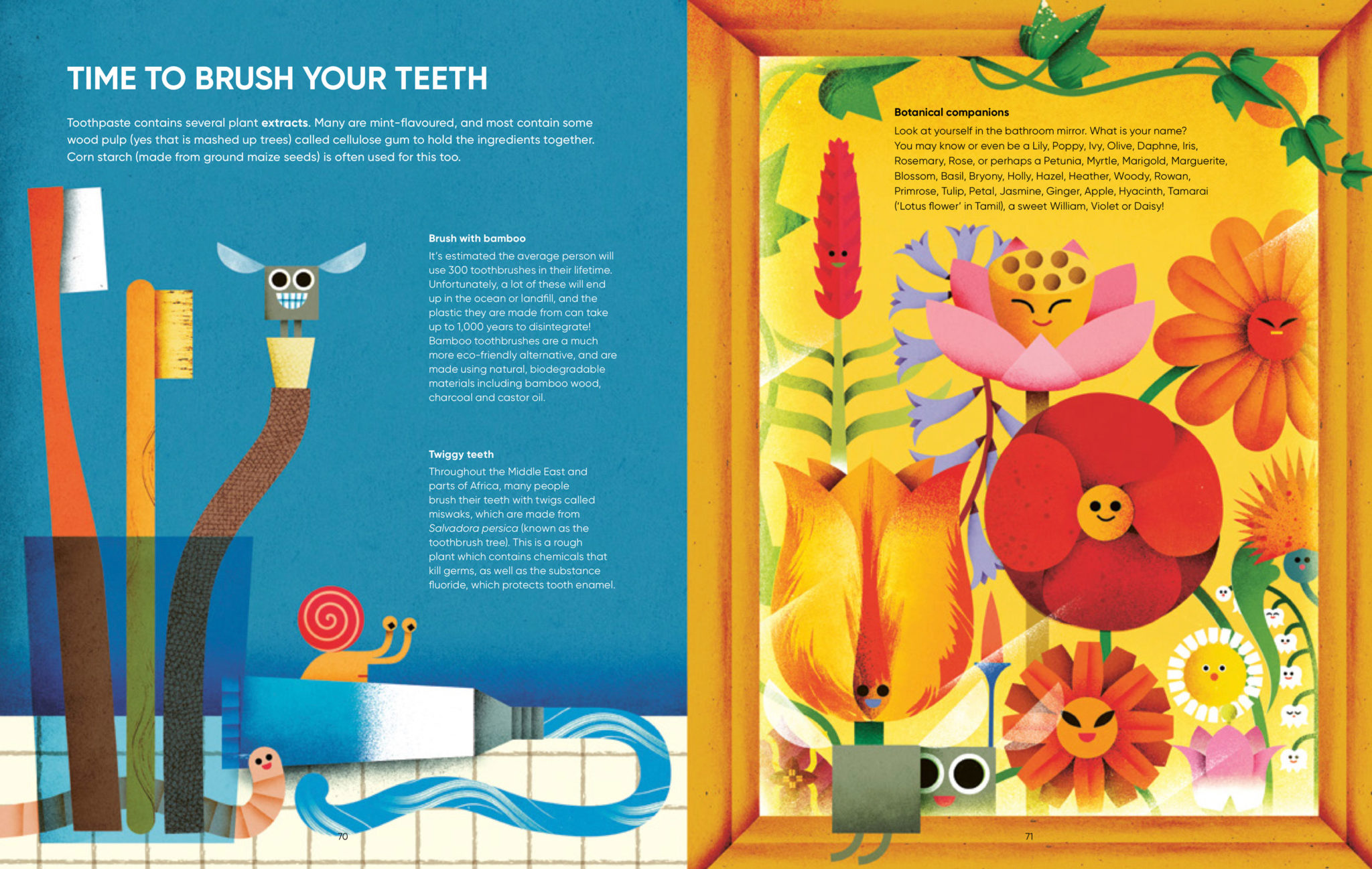
To introduce the world of plants to children, I created a group of humanised quirky insect characters led by “Little Square”, a square-shaped fly, that appear throughout the book.
FEB: What is your creative process when working on a children’s book? How does this differ to other work you’ve been commissioned for?
PG: It’s my first non-fiction book and there is a lot of illustrated page: 114! As I’ve never done a book before dedicated exclusively to plants, it was something completely new, regarding both the non-fiction aspect as well as the amount of work to be managed in a limited time. It was a bit overwhelming, but also very exciting.
Fortunately, I got to work with an excellent team. I’d like to thank the remarkable designers for their outstanding direction as well as my dear agent for her reassurance in difficult moments.
FEB: And was there a most challenging part you found working on I Ate Sunshine for Breakfast?
PG: One of the difficult parts was managing the work in different locations. During the making of the book, I was travelling a lot for work. The storyboard part started in the Japanese countryside and ended around Taiwan and Honk Kong. Most of the final illustrations were made in my hometown in Italy.
I was fortunate in that I got ideas by directly observing the flora in the different countries I visited. Like some strange fruits eaten in Hong Kong, or tropical ferns spotted in Taiwan, or ancient pine trees in Japan. I tried to put these things into the book. (You can spot them ;) )
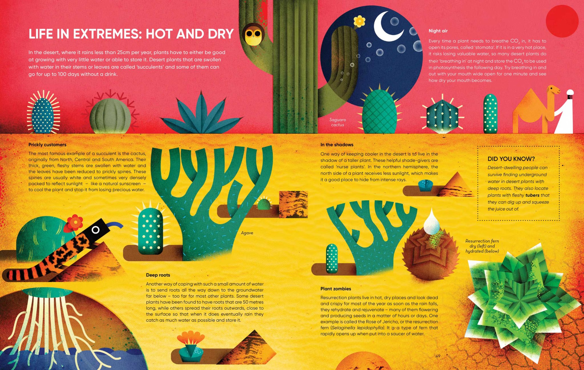
FEB: Your artwork is SO vibrant and bursting with energy, where do you get your colour inspiration from? And how do you create your textures?
PG: From my childhood, from all the time I spent alone in the fields watching insects and other small creatures all day long. From a book, found in Tokyo before starting the project, about fabrics and wallpapers from the fifteenth century to the present day. There are beautiful and unusual palettes. I create my textures by scanning patterns made using monotype techniques, ink brush strokes, collage out of old paper.
FEB: The animals and plants illustrated in geometric, dramatic art style have such beautiful quality. How did you develop this visual style?
PG: approached illustration because I wanted to reproduce the beauty of natural creatures, their colour and their complexity. My course in naturalistic painting (20 years ago!) gave me the basis to faithfully reproduce things with pictorial mediums. I still have the hobby of painting realistically on wooden boards.
At a certain point, however, I was fed up with representing reality, with all its shadows, shades, perfect proportions and boring rules on perspective. I needed to simplify, tidy up, see things from another point of views. This coincided with my arrival in Japan where I’ve been living for the last 9 years. In particular, I immediately fell in love with a certain essential and geometric Japanese graphic style from the 1950s (Takashi Kono) and started to observe and study them. It was a natural process. And, I was in Japan where the abstraction of forms is the basis of their aesthetics.
FEB: If forced to pick just one plant, which is your favourite of all?
PG: From the plants I draw, one of my favourites is the tulip with its bulb and roots. One of my favourite plants (a Plant that I want at home with me) is the big fern tree! I think I miss the jungle house of my childhood.
FEB: And what was your most favourite part of the book to illustrate?
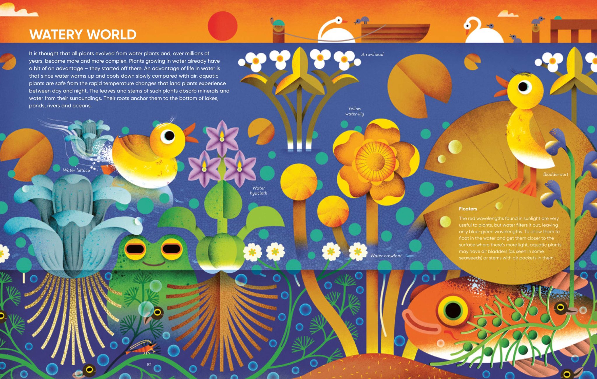
PG: I had fun creating the compositions of the 4 chapters. One of my favourite pages is “Watery World”.
Thanks so much for taking the time to answer our questions Philip!
You can order a copy of I Ate Sunshine for Breakfast here and find downloadable activities to do at home here.